#FinTech
#Mobile
#b2c
Designing a 0→1 financial app
As the sole product designer, I shipped the full mobile MVP in 12 weeks and have been driving the product’s UX evolution ever since, balancing user needs, technical constraints and fast-moving business goals in a startup environment.

Role
Product Designer
Scope
Strategy, UX/UI, 0→1
Timeline
Oct 2024 - Dec 2025
Platform
Android, iOS
Project overview
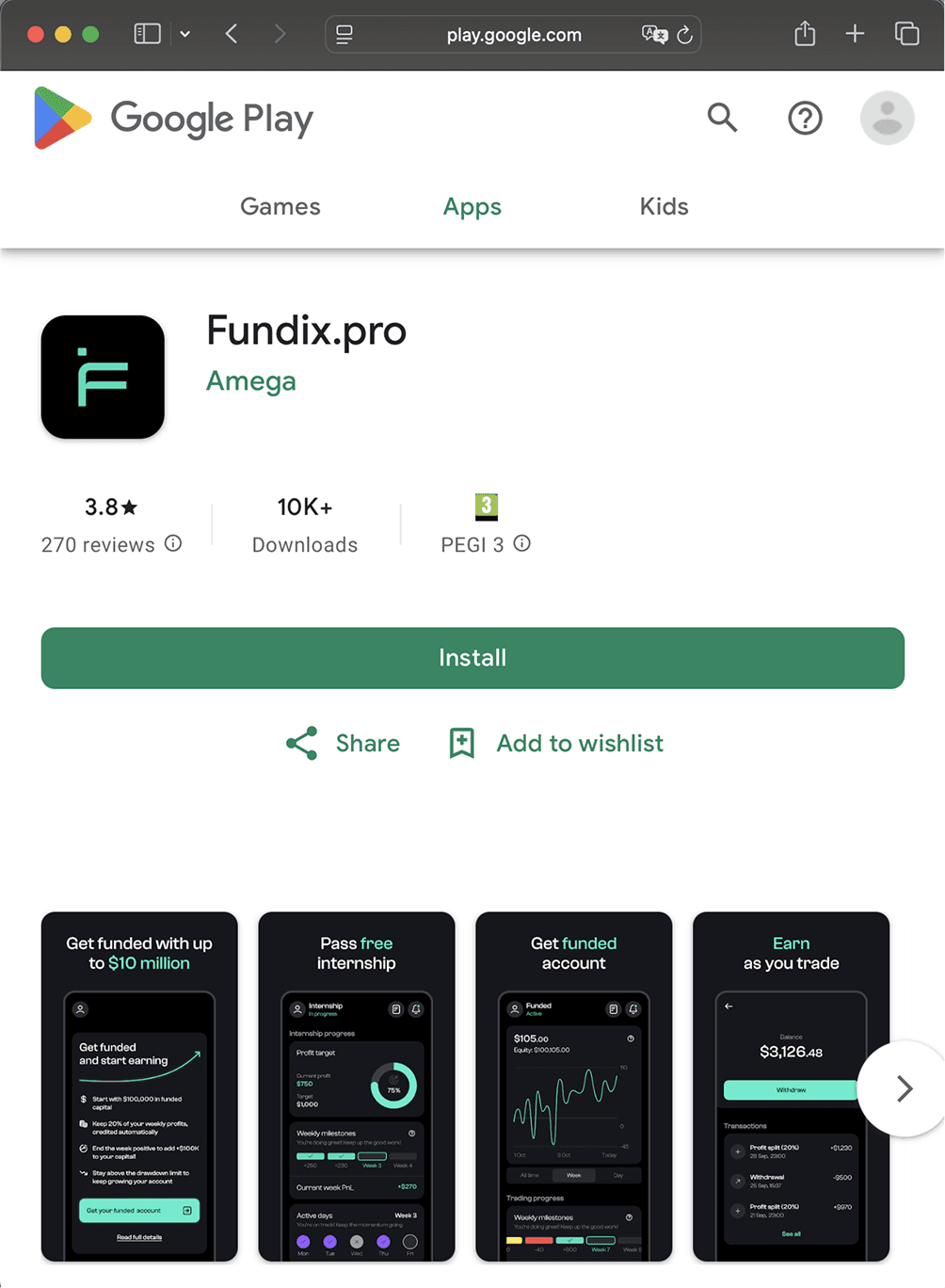
Fundix is a mobile trading platform that helps experienced traders practice with virtual capital and qualify for real funded accounts. My role was to design the product end-to-end, from defining the core experience to supporting continuous improvements post-launch.

Challenge
Designing Fundix meant working under tight constraints as the sole product designer. I had 12 weeks to ship a mobile trading MVP while the business model and trading rules were still evolving. At the same time, I needed to build a clear, trustworthy experience in a domain where users often expect complexity, or even scams.
Goals
Deliver the MVP fast to validate the new business model
Make complex rules and progress easy to understand
Build trust in a low-trust domain
Constraints
Tight timelines requiring fast decisions
Evolving business logic led to frequent redesigns
Limited engineering resources demanded pragmatic solutions
Top KPIs selected
Discovery & research
With limited analytics early on, I gathered insights from every available source:
Analysed 1,000+ support tickets & chats
Interviewed 5 users and 3 professional traders
Reviewed trading community discussions on Telegram & Discord
Benchmarked leading trading apps to extract proven UX patterns
Monitored basic early-stage Mixpanel + Play Store analytics
Key insights
New users struggled to understand statuses, rules, and next steps
The core trading flow felt inconvenient compared to industry standards
Trust was fragile, errors or slow actions created anxiety
After failing once, many users dropped off
Together, these patterns revealed three core problems: clarity, speed, and trust. These insights guided what I improved next: clarity in rules, speed in trading flows, and transparency across key actions.
Approach
Given the tight timelines, changing business logic, and limited engineering capacity, I relied on a few core principles to keep the UX coherent, feasible, and scalable.
Impact-first scoping
I started each task by identifying the parts of the journey where friction had the highest cost: onboarding, trading actions, progress tracking, and money-related steps.

Collaboration & iteration
I worked in iterative loops with the PM, CEO, and engineers to refine logic and validate feasibility. This minimised rework and kept the experience coherent as the product evolved.
Reuse & adaptation
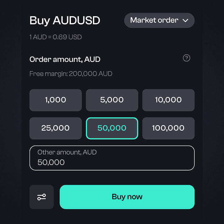
For the MVP, I adapted existing designs for trading flows from our other trading product to launch fast. Later, I redesigned these flows using benchmarks and user feedback.
Lightweight design system
I built a minimal, flexible design system with reusable components, allowing the product to scale with new features while staying visually and functionally consistent.
Solution
From research, three problems became clear: users didn’t understand the rules, trading felt slow, and trust was fragile. So I focused on improving clarity, speed, and confidence.
Design decision 01
Made trading rules easy to understand
To pass the Internship and become funded, traders had to follow strict rules: profit targets, loss limits, and consistency requirements. Many users didn’t understand where they stood or how close they were to breaking a rule.
I turned these rules into simple dashboard widgets that show:
progress toward the next stage
distance to risk limits
warnings before disqualification
This helped to reduce repeated questions about rules and disqualifications in support and community chats.

Turned complex trading rules into simple dashboard widgets
Design decision 02
Reduced friction in trading flows
Traders open and close positions many times during a session, so even small delays matter.
“99% of time I’m checking the pairs, so I want to navigate as fast as possible to take a decision”
To launch the MVP quickly, I reused trading flows from our other product. Later, after analysing user feedback, support tickets, and competitor apps, I redesigned key trading flows.
The update focused on reducing steps, improving layout clarity, and supporting faster trade execution.

Portfolio redesign: Before and After

Made trade execution simpler and faster
Design decision 03
Built a lightweight design system for scale
Fundix was evolving quickly: new features, changing trading rules, and frequent UI updates. To keep the experience consistent and avoid redesigning screens from scratch, I created a lightweight design system with reusable components and clear patterns.
This allowed me to:
speed up design and development of new features
adapt quickly to changing business logic
keep the interface consistent as the product grew

Created a lightweight design system
Outcome
0 → 1 in 12 weeks
Designed the full mobile MVP from scratch as the sole designer
10K WAU
Reached shortly after MVP launch, showing strong early adoption
Fewer support requests
Rule visualisation reduced confusion around trading limits and disqualifications
Faster trade execution
Simplified trading flows reduced steps to open and manage positions
Design system with 70+ components
Enabled consistent UI and faster feature development across the product
Reflection
Insights don’t come only from formal research
Support tickets, trader chats, and everyday conversations with the team often revealed where users misunderstood rules and risk limits.
Design often means making trade-offs
With limited time, budget, and engineering capacity, my role wasn’t just designing the ideal UX, but finding solutions that were feasible, scalable, and right for the product at that stage.
Early collaboration prevented rework
Close collaboration with PMs and engineers helped keep the product coherent as business logic evolved.