#FinTech
#Mobile
#b2c
Building a social copy-trading app
As the sole product designer, I took an early prototype and grew it into an Android MVP, designing all flows and screens, a design system, and a product landing page.

Role
Product Designer
Scope
UX/UI, Design system, Research
Timeline
Feb 2024 - Sep 2025
Platform
Android, Web
Project overview
Wanz was a copy-trading app aimed at Gen Z users with little or no investment experience. The idea: follow a professional trader, and your account automatically mirrors their moves. To make this feel approachable, not intimidating, the product also had a social layer: a feed of trading ideas, public trader profiles, and community features.
I joined when early research and a rough prototype already existed, and designed the product end-to-end as the sole designer over seven months. The project was paused before launch.
Challenge
Wanz was an ambitious product: copy trading for beginners, a publishing platform for pro traders, and social features woven through both. How do you make something approachable for someone who has never traded, while also serving experienced traders who need real tools? And underneath it all: a backend architecture (wallet, trading accounts, strategies) that didn't map cleanly onto anything users already understood.
And underneath it all: a backend architecture (wallet, trading accounts, strategies) that didn't map cleanly onto anything users already understood.
Constraints
Backend architecture imposed hard limits on what could be simplified in the UX and UI
Two user types with fundamentally different needs
Fast-moving product with frequently evolving requirements
Approach
Section by section
I worked through the product section by section. Design, review with the PM and developers, iterate, hand off, then review after it was built. Some sections went through several rounds.
Design system from day one
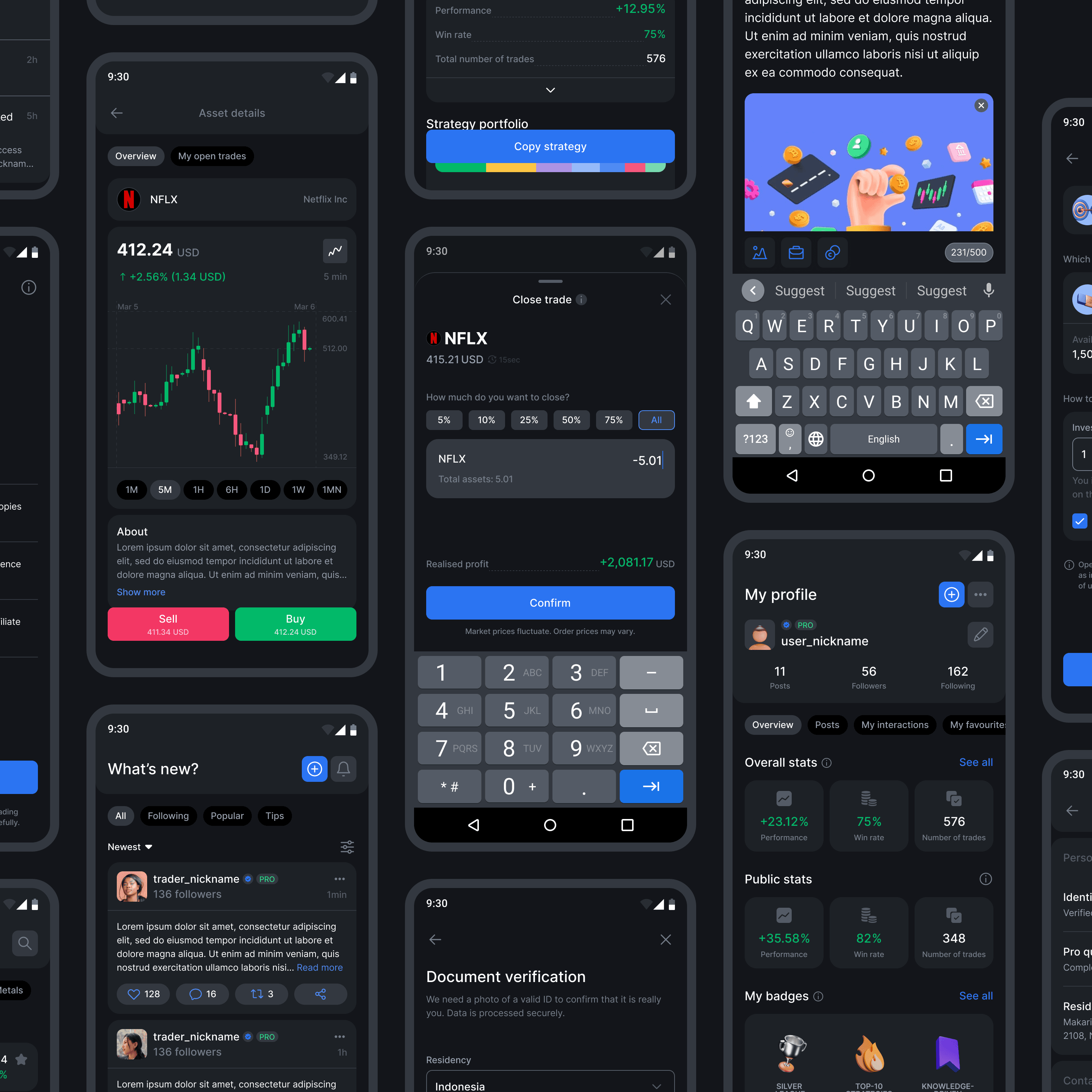
I built a token-based design system in parallel, with two themes. This kept the product visually consistent as it evolved and made rolling out changes faster.

Prototypes for testing and alignment
I built several interactive prototypes throughout the project. Some were for presenting complex flows to stakeholders and aligning the team, others were used directly in usability tests with real users.

Research alongside development
I used Useberry to run unmoderated tests on two core flows, then followed up with in-depth interviews. Each round fed back into the ongoing design work.
Solution
Design decision 01
Designed for two very different users in one product
Wanz had two very different users: beginners who wanted to copy a strategy without really understanding trading, and pro traders who wanted to publish strategies and earn from them. Research confirmed they came in with completely different expectations.
For beginners, I designed a guided copy flow with just enough context to feel safe.
Beginner flow: copying a strategy
For pro traders, I built dedicated tools: a Markets section for trading and managing positions, a publish flow, per-strategy dashboards with charts and stats, and a public profile to showcase their track record.
Pro trader flow: publishing a strategy
The Hub became the structural anchor for both flows: a central entry point that surfaced different paths depending on what a user was trying to do.
Design decision 02
Helped users evaluate and trust a trader
I designed the first version of the trader list with names and tags, but no performance data. After prototype testing, it was clear users had no idea who to tap or why. I redesigned the cards to surface weekly performance and follower count at a glance, so you could compare traders without opening every profile.

Top traders list – before

Top traders list – after
The profile needed to work for someone deciding whether to copy, not just browse. I designed four tabs: Strategies for published strategies and stats, Posts for social content, Badges for achievements, and Similar profiles for when users wanted to compare options before committing. Performance, followers, and following stayed visible above the tabs on every view.
Trader's public profile
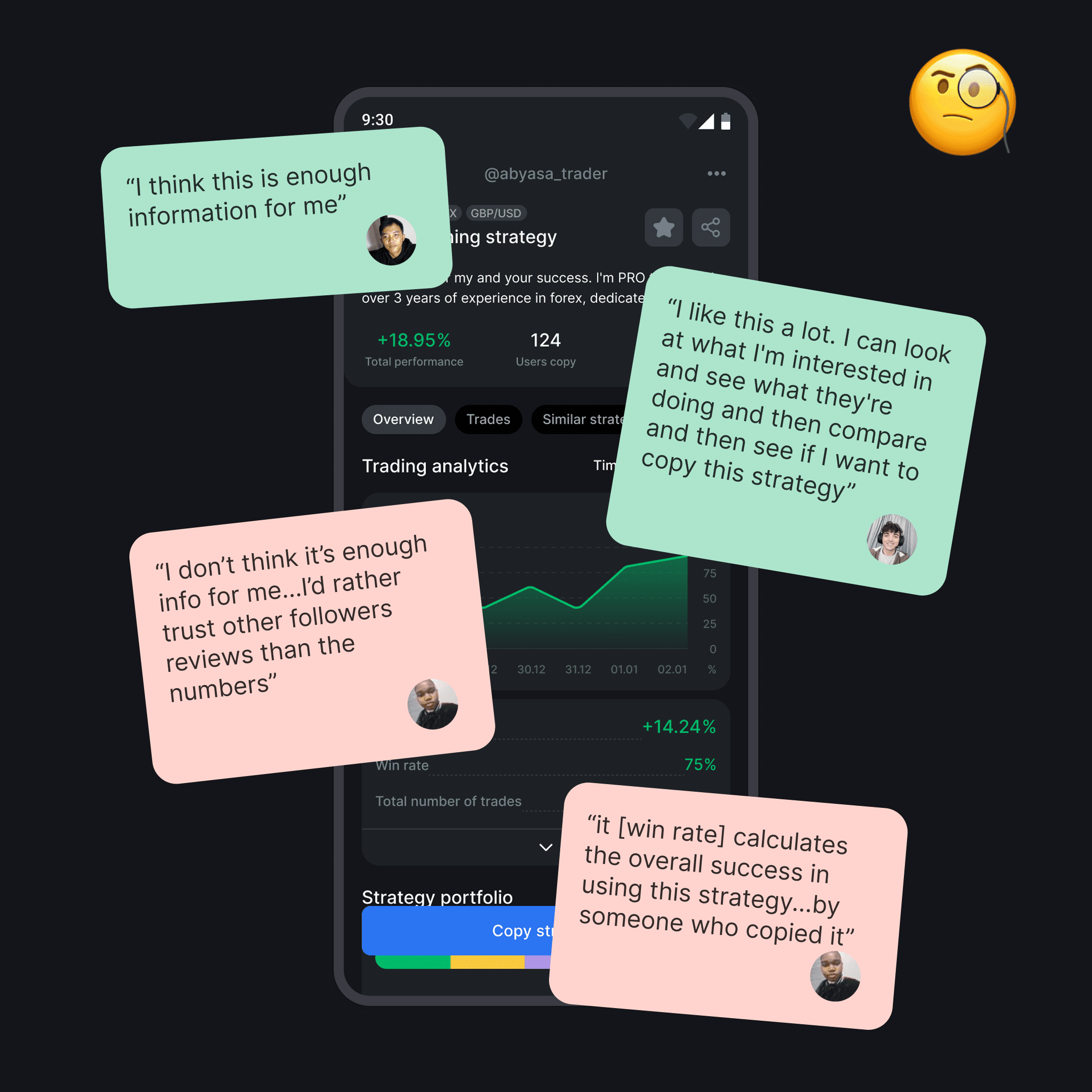
One gap research flagged that didn't make it into the MVP: users wanted reviews from other copiers alongside the numbers. That went on the roadmap.
“I don’t think it’s enough info for me... I’d rather trust other followers reviews than the numbers”
Design decision 03
Made the social layer work for a financial product
Early research, done before I joined, had already validated one key decision: starting with a social feed worked well for the target audience. My job was to make it work as design.
Posting to the feed
Social features ran through the whole product, not just the Feed. Strategies showed how many people were copying them. Profiles surfaced social activity alongside trading stats. Notifications covered both trading and social events.

Comments on a post
User profile

Notifications
Outcome
The project was paused before launch. No product metrics to share, but here is what I shipped:
110+ screens designed
Near-complete Android MVP across all flows and screens, light and dark modes
App design system
Built a token-based app design system with two colour themes
Product landing page
Finalized, handed off, and reviewed post-development, built web design system
2 rounds of usability research
Unmoderated tests in Useberry and moderated interviews with 40+ participants total, findings presented to the team
Interactive Figma prototypes
Some for presenting flows to stakeholders and aligning the team, others used directly in usability testing with real users
Reflection
Task success isn't comprehension
Most users completed the core flows in testing. But interviews revealed many hadn't understood what they had done. That gap is where the real UX problems live, and why I combined unmoderated tests with in-depth interviews.
Two user types in one product means constant trade-offs
Every choice that made copying feel safer for beginners risked feeling too simple for pro traders. Getting the balance right took a lot of conversations with the team, and some decisions landed better than others.
You can't simplify everything, but you can decide what to hide
The hardest design challenge wasn't any single screen. It was figuring out which parts of a complex system users actually needed to see. That's as much a product problem as a design one.